HubSpot Rebrand: Designing for Motion
Developing a motion system for an evolving brand
Role
Lead Motion Designer
Industry
Software
Duration
6 months

The Big Idea
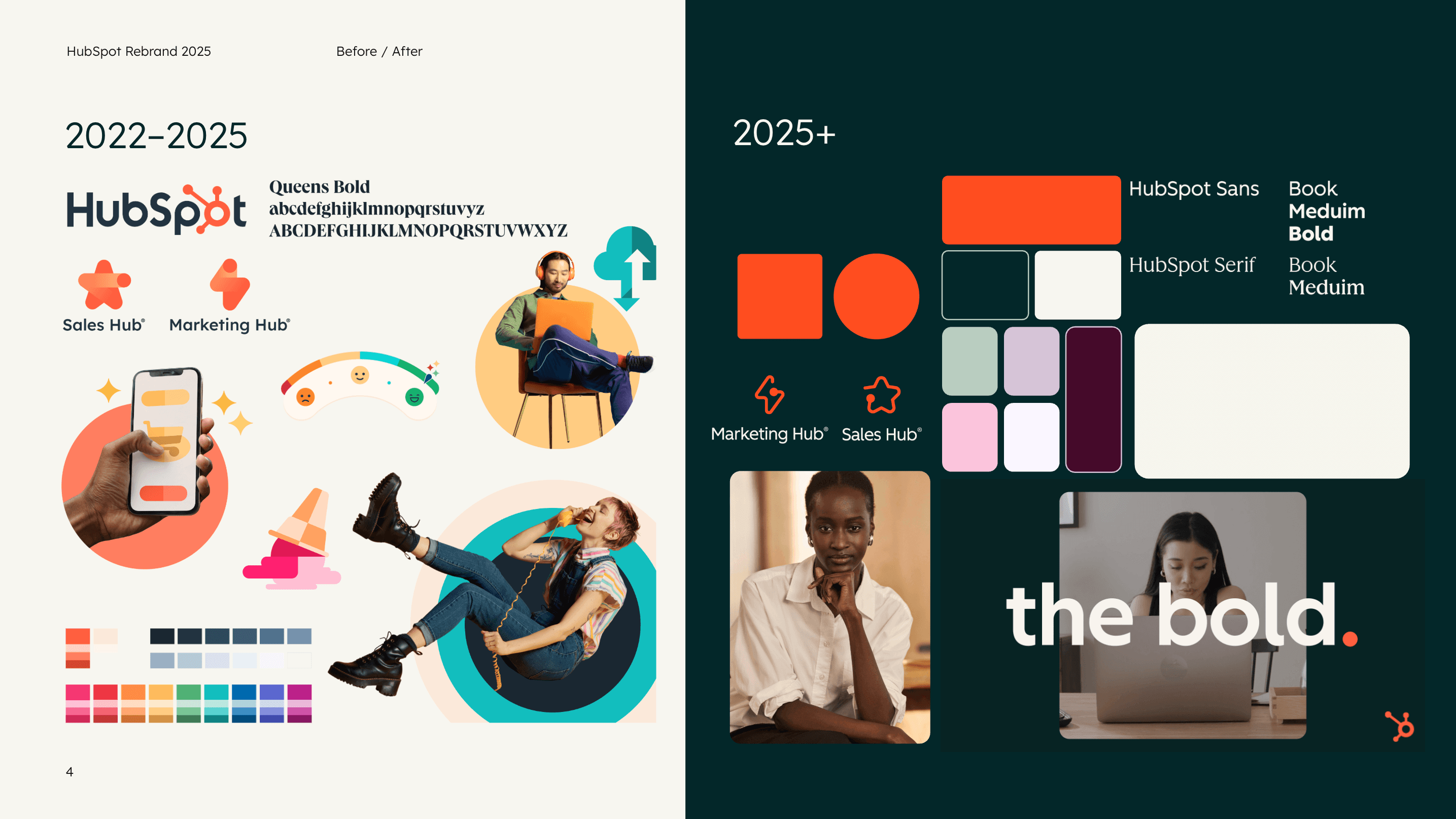
It was official: HubSpot was getting a glow up. This was a herculean effort to reimagine the HubSpot brand in lock-step across Brand, Creative, and Product teams. The goal was to modernize, elevate, and unify how customers experience HubSpot.
Primarily to elevate the company's perception, we worked to focus on 3 key areas:
Resonating upmarket: We wanted to have a brand presence that does not alienate upmarket customers, that makes Hubspot more contemporary, and continues to differentiate us.
Living our RTBs: Easy. Fast. Unified. Part of being unified is being consistent across our touchpoints, from the time someone sees our brand in the wild to the moment they use our product on their laptop. Both our product and our brand should be easy and fast "gets."
Building for Scale: We wanted HubSpot's brand and product UX to be able to scale in the future. It's a long-term investment that ideally reaps benefits for years to come as we iterate and improve how customers experience Hubspot's brand and product.


Motion-first thinking
My role was taking the guardrails and assets that our outside agency had supplied us with, and think through how to translate them into a language that made sense for the business across video and web applications.
Having been at the company 7 years at this point, I had seen first hand how difficult it can be for motion to stay consistent, and, more so, consistently excellent. We had already seen how our animated projects can easily degrade in quality or speed when we outsource to a freelancer who's not quite aligned with how we had been doing things, simply because those things were not clearly defined.
For months, I worked with the other Lead Motion Designer, Alex Kuzoian, as well as my boss, Oksana Sedivy, to build out a motion system for the company. All in all, this meant we were designing behavior for branded elements and answering big questions about how our brand showed up and moved across mediums. This meant we were to define and design Motion Design Guidelines (which would eventually live within our brand playbook), templates (After Effects & Capsule), and brand assets (animated logos, word marks, product visuals) that would align with our new look and feel.

Together, we built a system and language for thinking about motion design as a core component in the HubSpot brand, sitting nicely alongside our product design system, and rolled it all out at INBOUND 2025. This was a massive lift, to which anyone who's been through a rebrand can attest, and it was probably the biggest impact on HubSpot that I've had in my role here. From typography treatments, to wordmark reveals, to webinar transitions, to interactive web elements, I was able to think holistically about motion and its role as a major and consistent touchpoint across the business.
We defined motion principles that aligned with the new rebrand's direction and the company's values. We set clear rules around timing and easing. We created documentation that can be scale with the brand as it evolves.


Outcomes
Across the company, folks were impressed with the sophisticated look and feel of the new visual identity. It was the "glow up" we so desperately needed as a business. Within the company, folks were able to start using the templates and assets that we had created in their videos almost immediately. Outside of the company, folks responded to our public comms about the rebrand (across social channels and at INBOUND) with excitement.
This project was such a huge lift across the entire company, and I'm so grateful I got to work on shaping how our brand shows up in the world. Our motion system is so clearly defined now that we've already seen a great deal of alignment across projects. I think a large part of this is because we answered some of the bigger questions around behavior and brand creative, rather than just adding decoration to a still design.
Other projects

HubSpot x Canva
Launch video for Canva integration that allows users to experience Canva's complete design experience directly within HubSpot.

"Why HubSpot" Video | Partner-Led Events
Creating an eye-catching animated overview video to enhance in-person events that are led by Solutions Partners

INBOUND 2025 Intro Video
Get the people going (but in an AI-first kind of way)

Personal Work
Let's play!
